Foregoing the British festive decorative tradition of “more is more” in favour of the Scandinavian monochrome look, our Christmases might look tame in comparison with others. To others they may look sparse, cold or even un-Christmassy. But where an abundance of light and colour can overload the senses, a more selective approach to decorating at Christmas can yield equally cosy results. Here’s a quick look at how I’ve styled our home for Christmas.
It’ll come as no surprise to anyone reading this that Scandinavia is the primary source of my inspiration for the interior of my home: full stop. Monochrome interiors, stark whites, shades of grey and coal black touches here and there typify the genre of interior design. You’d think an abundance of black, white and grey would create a cold environment, but you’ve got to remember that this design ethos comes from cultures who are used to the cold and the darkness of winter. They even have words for cosiness that transcend what we take for granted in its meaning. In fact entire books have been written on the subject of hygge and mys that they’ve passed into the subconscious of coffee table discussion.
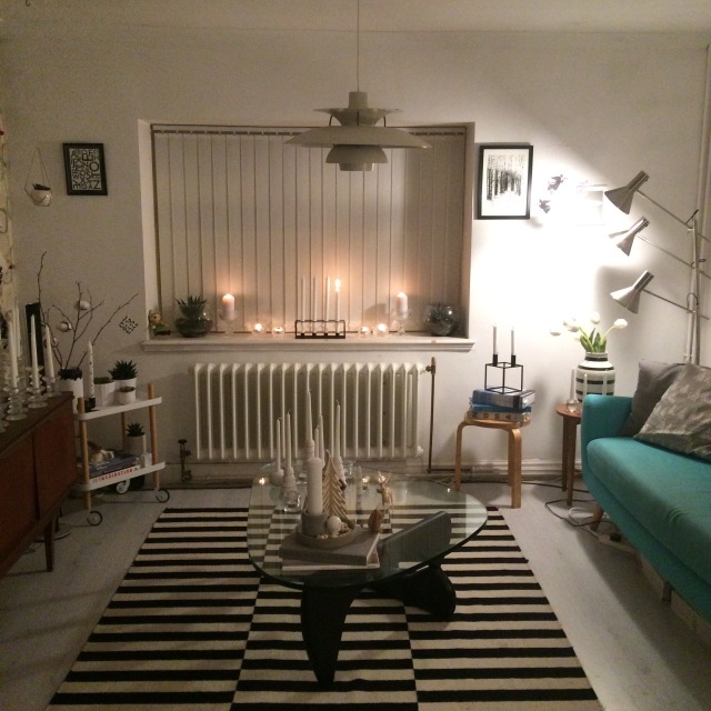
There is no more hyggelig a time of year than Christmas and an absence of abundant colour does not mean an absence of warmth. This year in fact I decided to incorporate the teal of our Made.com Jonah sofa and armchair (last year I had them temporarily upholstered in black for the Christmas period). Colour is unavoidable – there’s the inevitable green of whatever tree or greenery you’re introducing, but then there are the inevitable colours of your furniture. It’s all about arranging what you have to create the mood or atmosphere that you want.
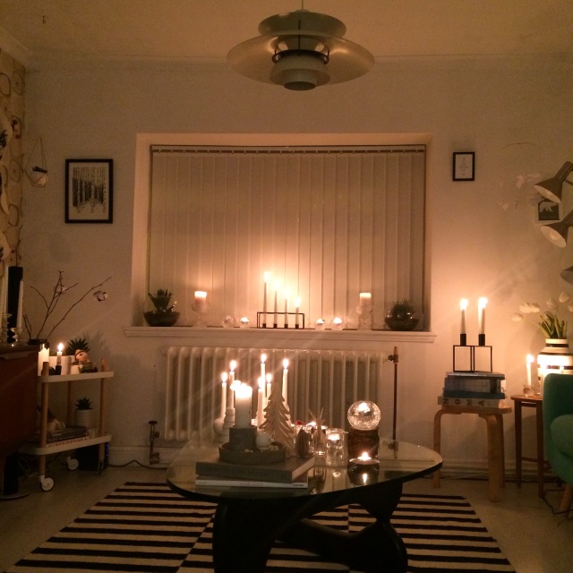
On the coffee table I decided to create a winter forest of candles with Kähler hammershøi candle holders, my white tree from Flying Tiger, the tree candles I got from Denmark last October, the numerous tea light holders I got from H&M home and the Ittala Kivi. Dotted among the “trees” is a little plywood Moomin from Lovi, a stag and some DIY nisse I picked up from Søstrene Grene. The composition is designed to echo the “forest” of Ittala Festivo candle holders sitting resplendent on the sideboard. When the whole thing is lit the effect is extremely hyggelig.

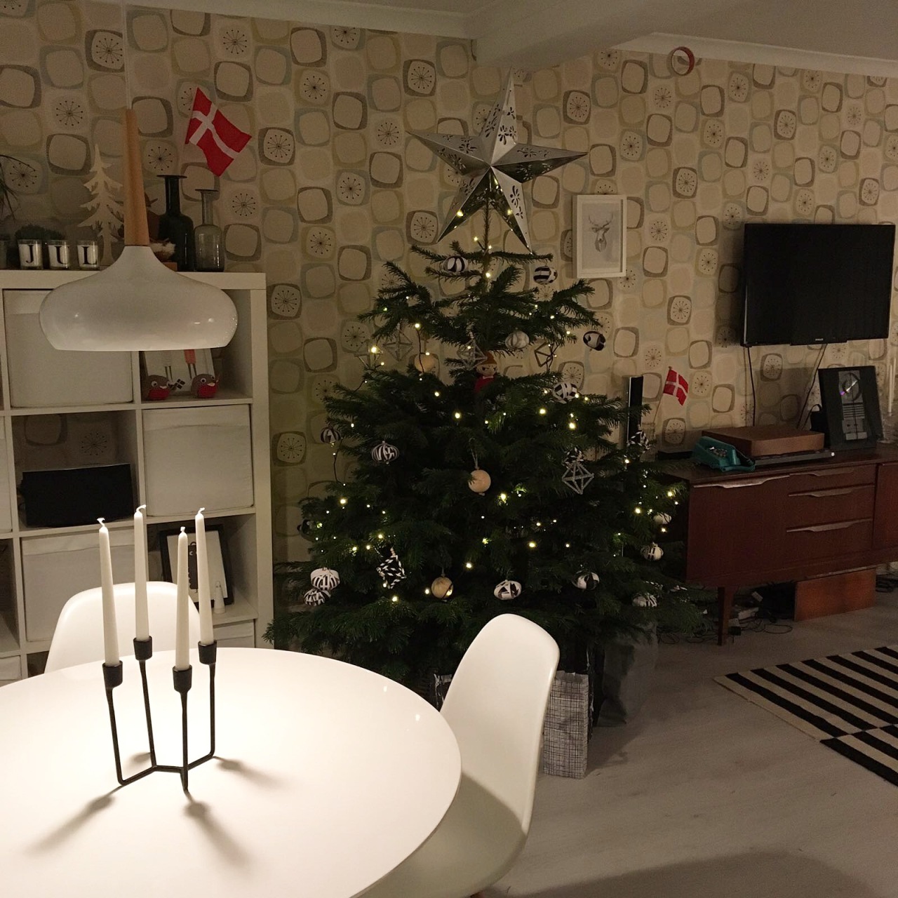
Our tree is a simple five footer decorated with home-made Himmeli made from black and white paper straws, the idea for these came from Nalle’s house. We’ve also made baubles from black and white patterns printed on card and formed into shape with wire (also from Nalle’s house). A single set of 6 wooden baubles break up the pattern white one set of 100 lights bring light to the tree. Sitting above the tree is our silver star decoration that we got from Home Bargains (of all places!). Clearly intended as a free hanging decoration, the star makes a perfect tree topper to complete the look.
The trick when styling monochrome is to balance heavy and light tones. The easiest way of doing this is by combining tea lights such as glass votives like the Snowballs from Kosta Boda, with a repeated thematic focal point like the himmeli decorations on the tree, which then tie in with the geometric artwork on the walls like the print from Emerybloom, the Kubus candle holder or the Kähler Omaggio vase in the corner. Humour can be used tastefully throughout the arrangement too. As I mentioned in a previous article, the santa hat for the Kay Bojesen monkey was an absolute must while the presence of the white Hoptimist by designer Gustav Ehrenreich gives a breath of life to the stark colour palette. From the opposite side of the room from the tree, the piercing eyes of our Olle Eksell print gaze out across the room, while in the corner sits the Normann Copenhagen tray table, which I’ve mentioned about styling here.
The monochrome shades of the pillows on the sofa and armchair sit beautifully against the teal. I’ve used the combination of a simple grey throw and plain grey cushions from IKEA’s GURLI range, a cushion that we recently picked up from Copenhagen (only 60 Kr!) and my Fine Little Day Gran cushion which keys in with the other patterns, holding the arrangement together. You’ll often find when styling a space that one or two pieces go on to influence a look for a space. The armchair sports a cute mountain cushion from Lagerhaus and the cross cushion from Zana Products.
Monochrome doesn’t have to be oppressive or joyless. In fact I would strongly argue that it’s a smart and surprisingly dynamic avenue to pursue precisely because it runs counter to common consensus. The only drawback is that currently the UK doesn’t really offer much in the way of readily available monochrome ornaments or decorative pieces. Over here black is always paired with gold and silver with white and there the creativity ends. As such, much of my collection has been sourced from abroad. I hope you’ve found some form of inspiration to try something new next year. I’m always on the lookout for new ideas and regularly begin sourcing pieces in advance. Be daring, take the plunge and go monochrome.